

A Practice in Atmosphere
Identity, sub-brands, retail space, event practice, and a foundation. A multi-vertical custom event design agency, designed end-to-end.
R O L E
Brand & Creative Operations Manager, Creative Bridge. Brand architecture, look and feel, product research, and budget.
D I S C I P L I N E S
Identity · Brand Experience · Events · Philanthropy
S U B - B R A N D S
Four + a foundation
T H E B R I E F
Pearwood Brands wanted to be more than a floral company.
The founder envisioned a multi-vertical practice that could deliver custom event experiences, floral arrangements, retail goods, and party rentals, with a philanthropic foundation extending opportunity to young creatives in the surrounding community. The brand needed to hold all of it without fragmenting.
Most agencies in this category had a single voice for events and let the side ventures run on their own logos. Pearwood would do the opposite. The parent brand would carry every line of the practice, and every line would carry the parent.
Build the parent brand first. The family will follow.
T H E O B J E C T I V E

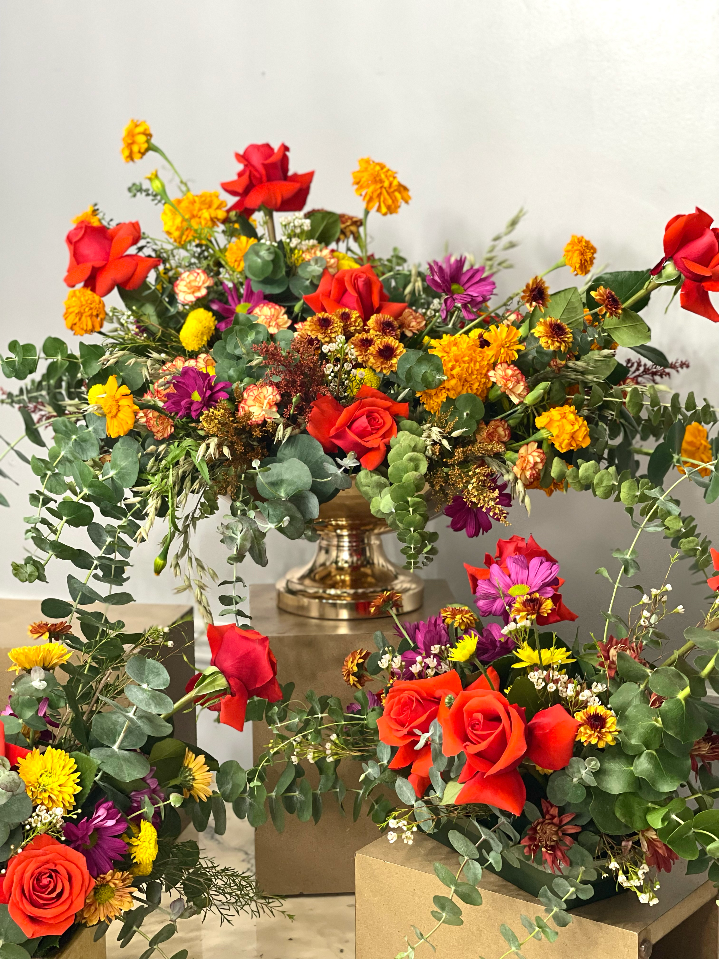
A multi-vertical practice fails when each line invents its own identity, and the master brand becomes a logo nobody recognizes. The opposite move is to design a parent that has so much room inside it that every line feels native when it arrives. The word “pear” became the architecture. Deep green and warm gold became the palette. A custom hand-illustrated foliage system became the connective tissue.
My role on the project spanned the architecture and the execution. I designed the parent identity and the sub-brand system. I developed the look and feel for each engagement that came through the door. I sourced the products and the materials, set the budgets, and served as the creative bridge between the client and the team that brought the work to life: the floral designers, the experience designers, the production team, the suppliers. The brand was the language we all spoke.
Around the mark, a complete system.

Use: Credentials and credentialed prints.
Use: stamps and embossing
Pill Shaped Badge
Circular Crest

Horizontal Wordmark Logos
Use: Banners, Letterheads and E-mail Signatures
Together, we outline a path forward that’s realistic, strategic, and tailored to your specific needs.
Primary Logo


Foliage Favicon Variation 1
Foliage Favicon Variation 2
Use: visual web browser tab identifier




Use: watermark on stationery and digital backgrounds.
Watermark
Isolated Foliage
T H E F A M I L Y
Four sub-brands sit underneath the parent. Each one has its own logo, its own visual personality, and its own audience. Each one ties back to the parent through the pear motif, the green-and-gold palette, or both.
Blossom-N-Roots is the floral division. The wordmark is hand-drawn in a friendly script, with a smaller N punctuating the two words. The lockup signs every arrangement, every bouquet, every delivery the company sends out.
Market & Pear is the retail division. The curated marketplace of luxury disposables, candles, charcuterie, and tabletop pieces, sold both online and in-store.
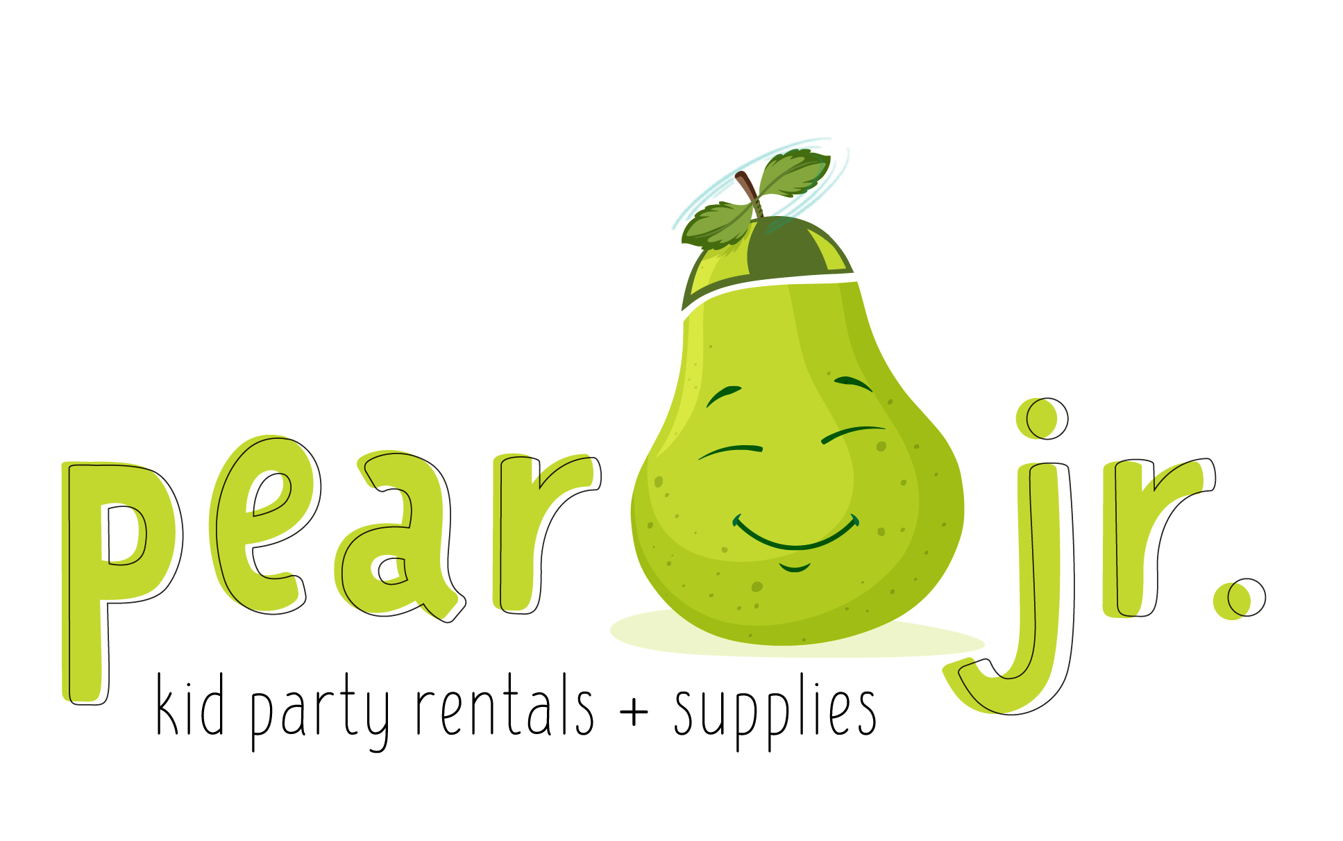
Pear Jr. is the kids' division for party rentals and supplies. A cheerful animated pear character sits inside the wordmark itself, in friendlier letterforms and a lighter green. The mark signals: this is play

The Pear of Hearts Foundation is the philanthropic arm. The mark pairs the pear with two overlapping hearts, signaling community and care. The foundation became the home for the work-study program described below.
Elevating E-Commerce into a Design Destination
T H E W E B S I T E
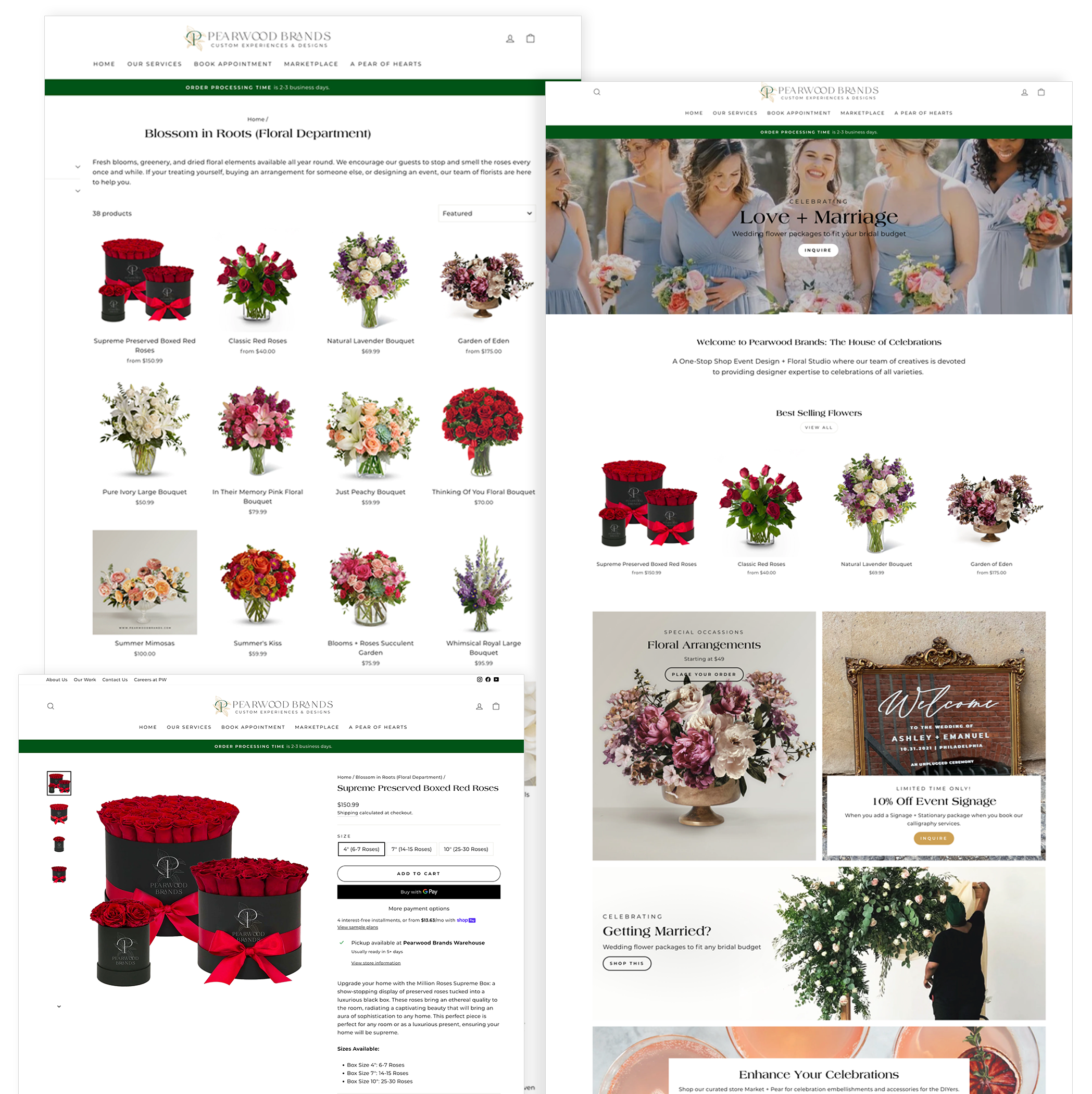
The primary objective is to transition the web experience from a standard online store into a premium "House of Celebrations" design destination. The digital flagship must mirror our physical spaces, balancing high-conversion e-commerce sales (floral, marketplace) with immersive, custom design services (events, vinyl, signage).
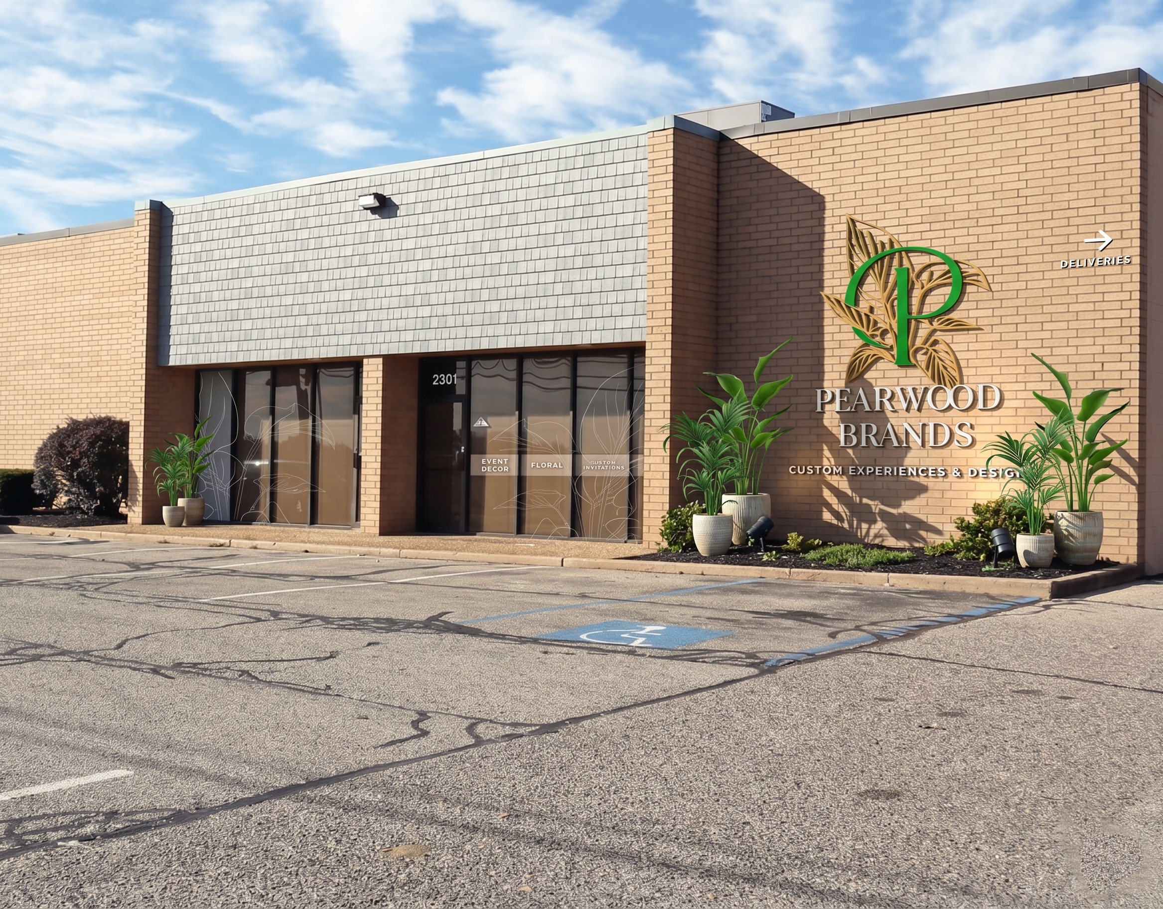
THE ATMOSPHERE
Harmonizing Inspired Ambiance with Operational Excellence across Departments
The objective for this dual-department initiative was to transform a cavernous, industrial workspace into an elegant, unified destination. The layout needed to captivate consumers through immersive storytelling while serving as a highly efficient, ergonomic engine room for the team executing the work behind the counters.
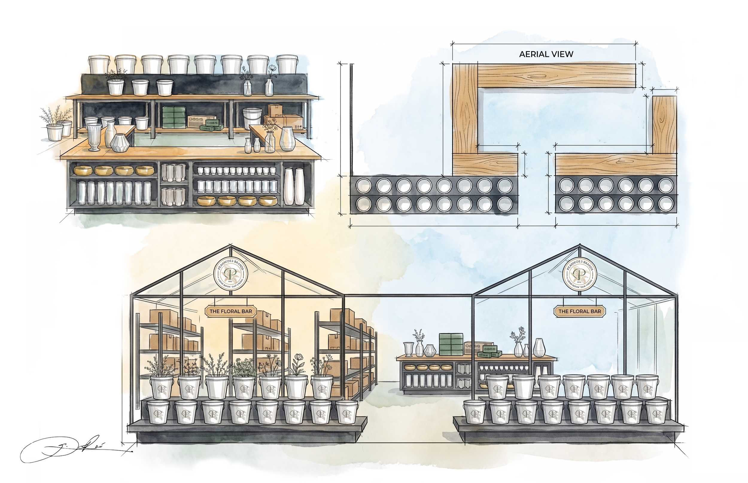
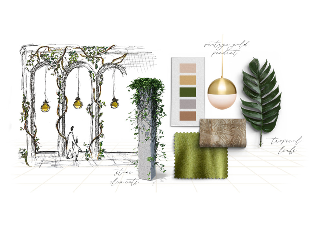
The Greenhouse Structure: Using custom-framed "greenhouse" pergolas, the floral department create “shop-within-a-shop" micro-climate inside the larger warehouse.
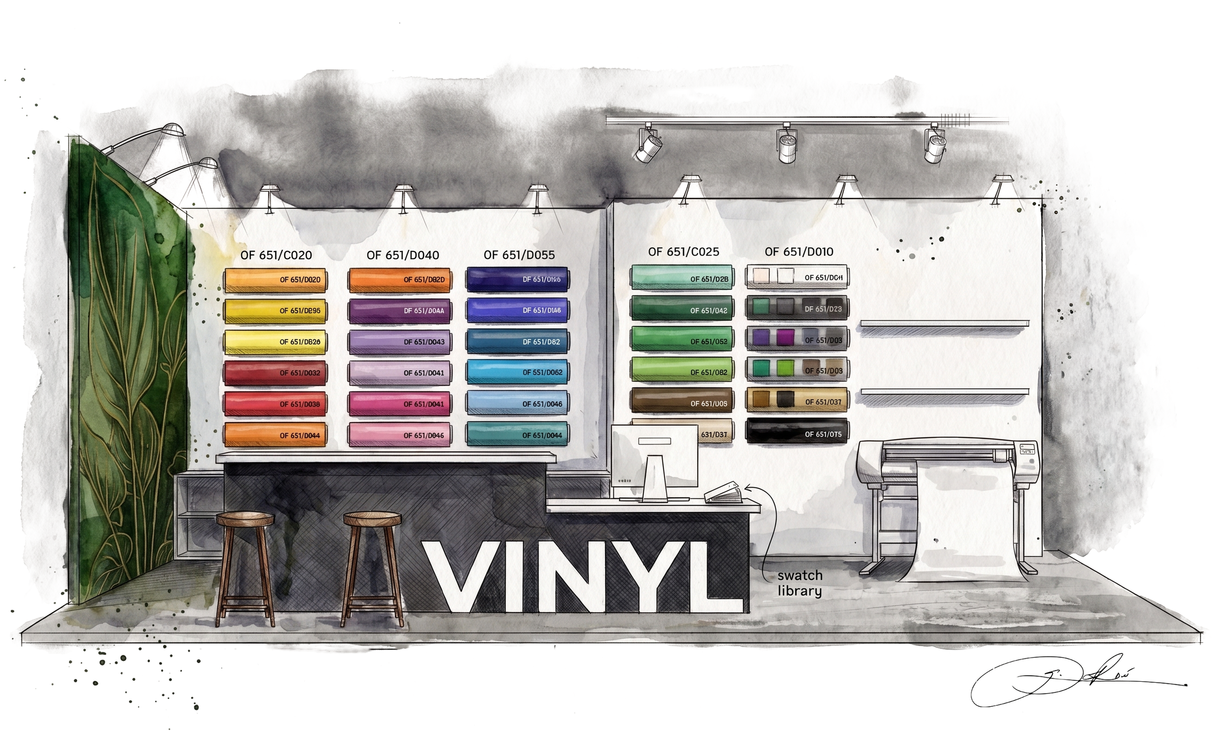
The Material Library as Art: A core tenet of this experience design is moving inventory out of hidden backrooms and putting it on display as a design feature. Industrial storage frames are reimagined as a vibrant, color-coded spectrum wall. This organized showcase allows clients to visually navigate weights, sheen levels, and color options smoothly during their consultation, making the selection process interactive. The workspace counter is engineered with dual-height ergonomics to split the consultation into distinct chapters. The lower section functions as a clean digital workflow station equipped with an accessible swatch library for reviewing proofs, layouts, and physical material finishes side-by-side. The slightly elevated front counter provides an active space where staff can unroll samples and trim mockups live in front of the customer.
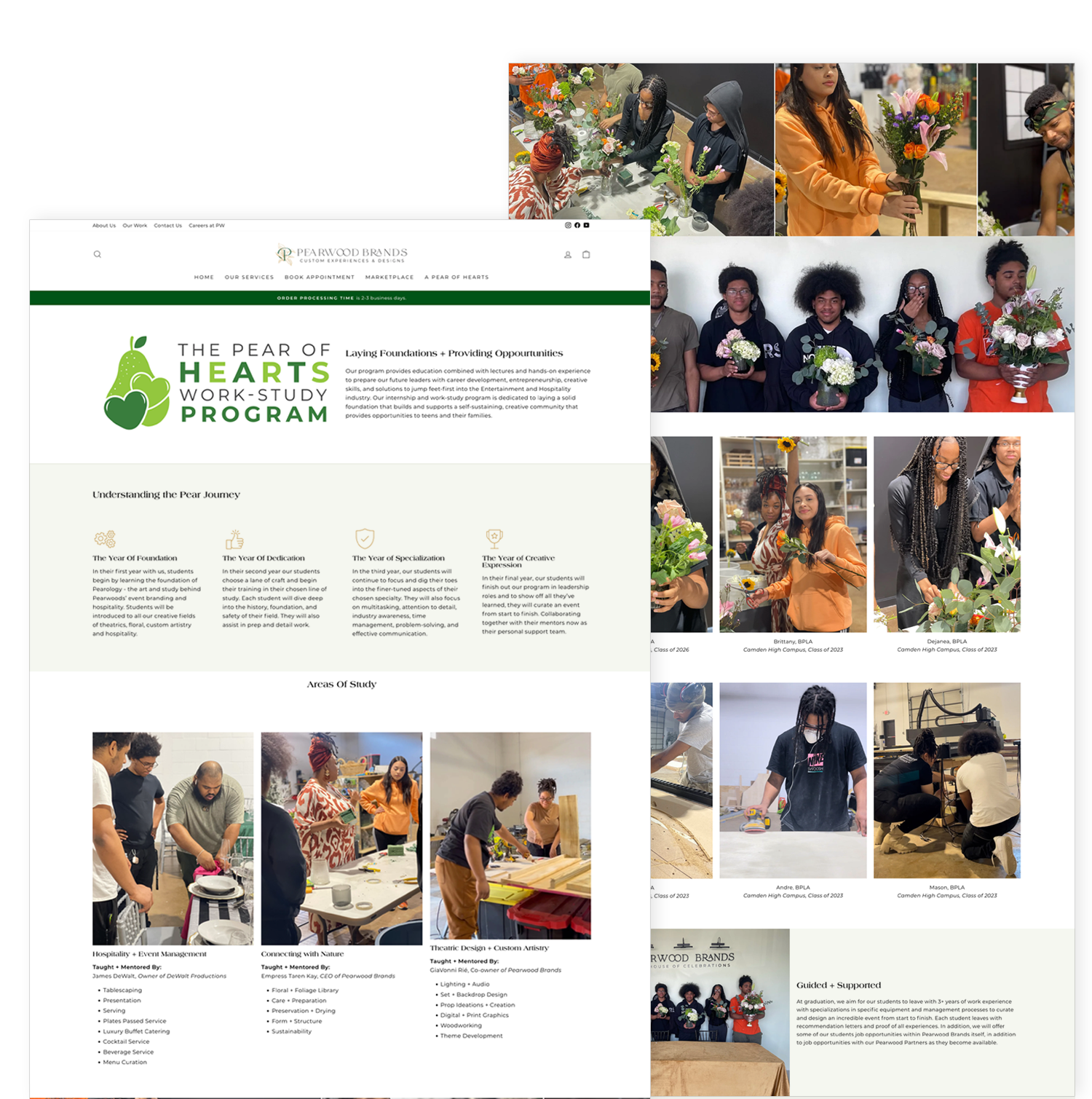
The Pear of Hearts Work-Study Program. Four years. Seven to eight students per cohort. Real mentorship, real work, real opportunity.
The Pear of Hearts Foundation became the part of the company I think about most.
A work-study program housed under Pearwood's nonprofit arm brought seven to eight high school students from local schools into the studio each year. The program ran on a four-year arc: the Year of Foundation, the Year of Dedication, the Year of Specialization, and the Year of Creative Expression. Each year deepened the student's capabilities and exposure. By graduation, the students had real portfolio work, real client exposure, and real relationships with mentors across floral design, calligraphy, framing, event production, and theatrical decor.
The program was taught and mentored by working professionals: the Pearwood team and a roster of partner florists, calligraphers, designers, and event leads. Students moved through disciplines including tablescaping, floral artistry, calligraphy, presentation, fine service, lighting and audio, set and backdrop design, props and accents, ceramics, woodworking, theatre, and conference production. A real curriculum, taught at studio scale, with real client work on the other side of it.