
Building Nicole
Identity, pattern, and packaging for the largest proprietary brand inside a national craft retailer.
R O L E
Lead Designer, Nicole, proprietary brand
D I S C I P L I N E S
Identity • Packaging • Pattern • Campaign
S U B - B R A N D S
Eight, Under One System
T H E B R I E F
Take the largest brand in the catalog and make it one brand
Nicole was the largest brand in the A.C. Moore catalog, but it was the least coherent. The mark appeared on dozens of products across nearly every department: kitchen, paper, beads, paint, kids, seasonal, each one with its own treatment, its own typography, its own claim to the name. The brand wasn't broken; there were just too many of them.
We wanted the customer to know that we understood what it meant to “Live Creative.”
Creating an experience that supports the creative nature of the A.C. Moore customer base.
T H E O B J E C T I V E
A.C. Moore customers were crafters, artists, hobbyists, bakers, knitters, and parents improvising a Tuesday-night project with their kids. The proprietary brand for those customers couldn’t look corporate; it had to look made. Most craft retailers were doing the opposite: cleaner sans serifs, color-blocked packaging, a vocabulary borrowed from the grocery aisle. We believed that Nicole could win by going the other way.
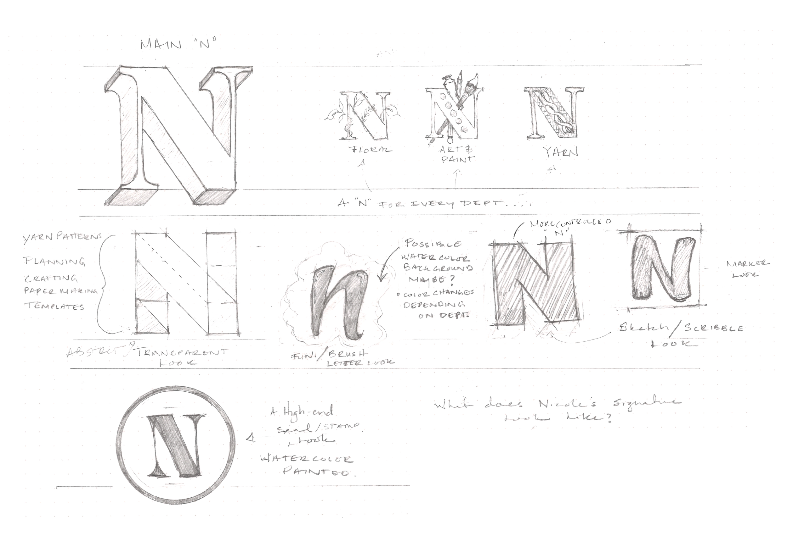
First Round of Explorative “N” Concepts
Differentiating A.C. Moore from all other craft retailers.
T H E M A R K S
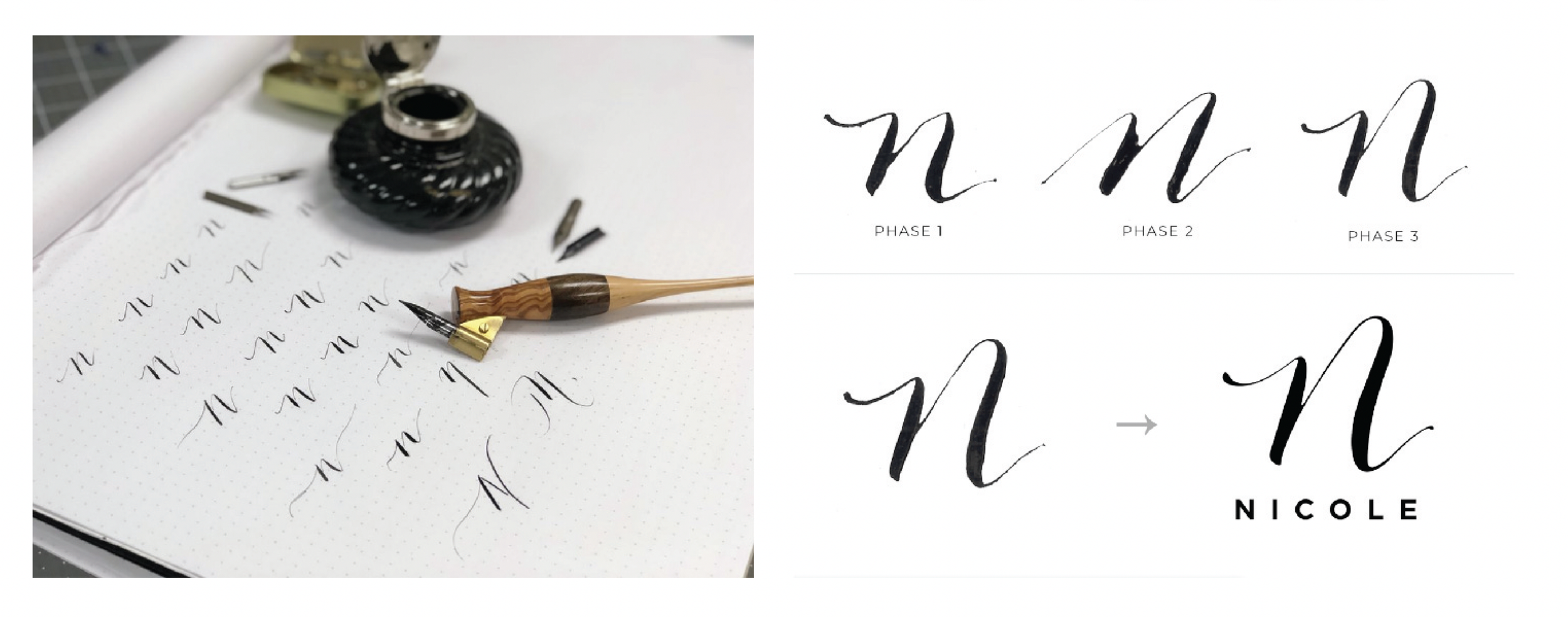
Second Round of Explorative “N” Concepts, Calligraphy Style
The hand-done calligraphic approach expressed a special and unique product that had an inspirational and exciting design aesthetic. The Calligraphic style would allow Nicole the opportunity to be more personable and exclusive to the consumer.
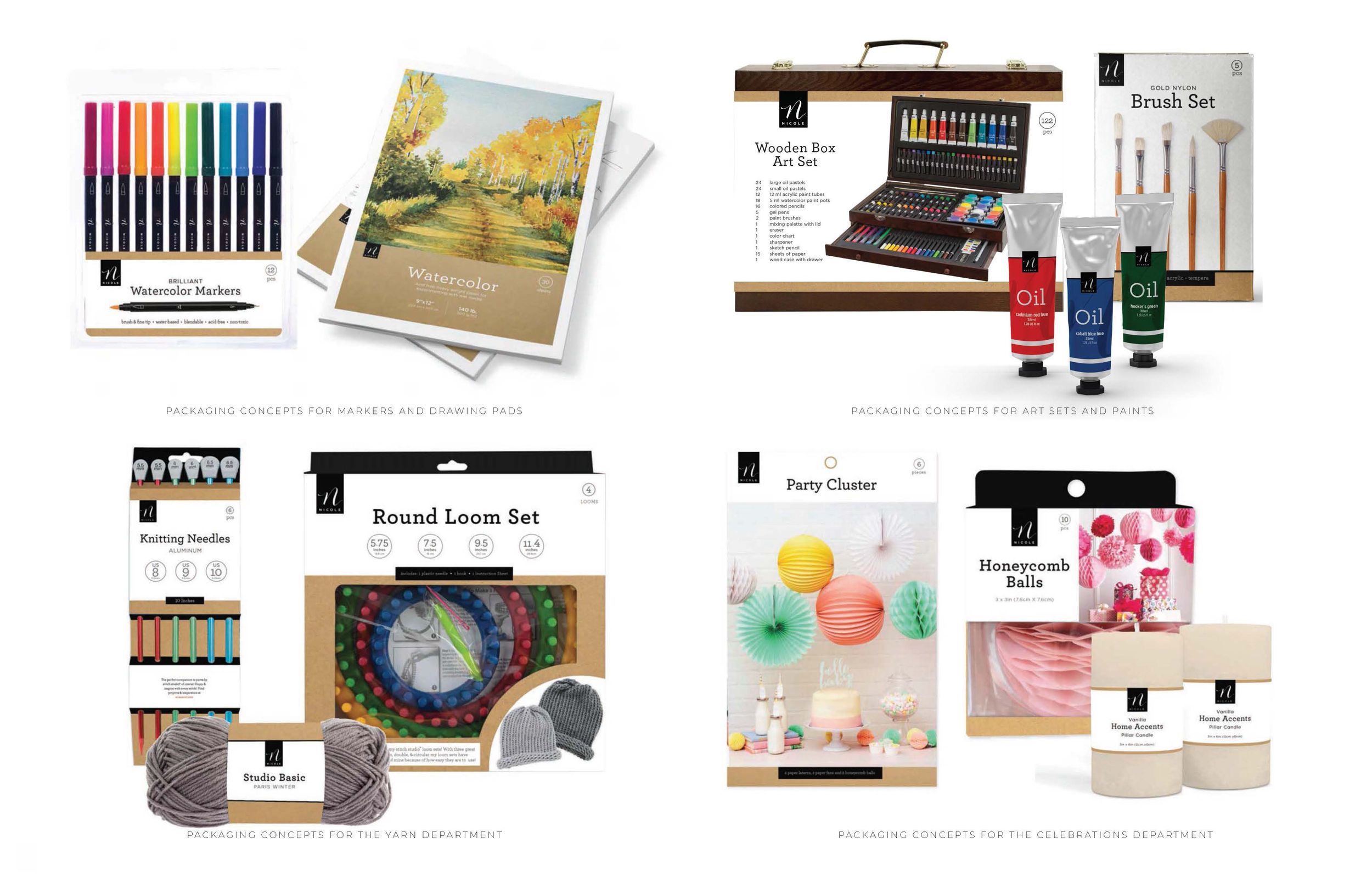
The monogram was the architecture. Every sub-brand inside the Nicole family, Stitch Studio, Nicole's Kitchen, Seasons By Nicole, Premiere by Nicole, Nicole Basic Crafts, Love Nicole, Nicole Bead Shop, BrightMinds By Nicole could sit underneath it without losing its own room.
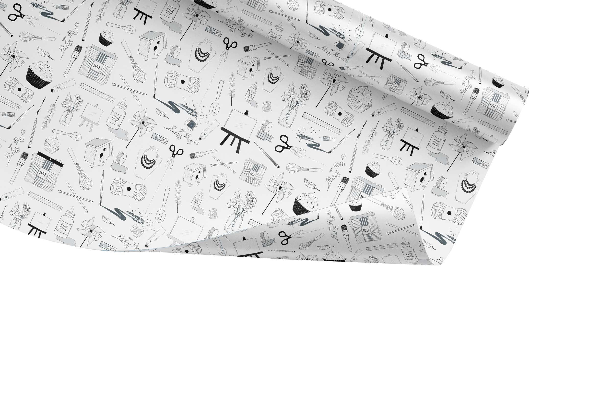
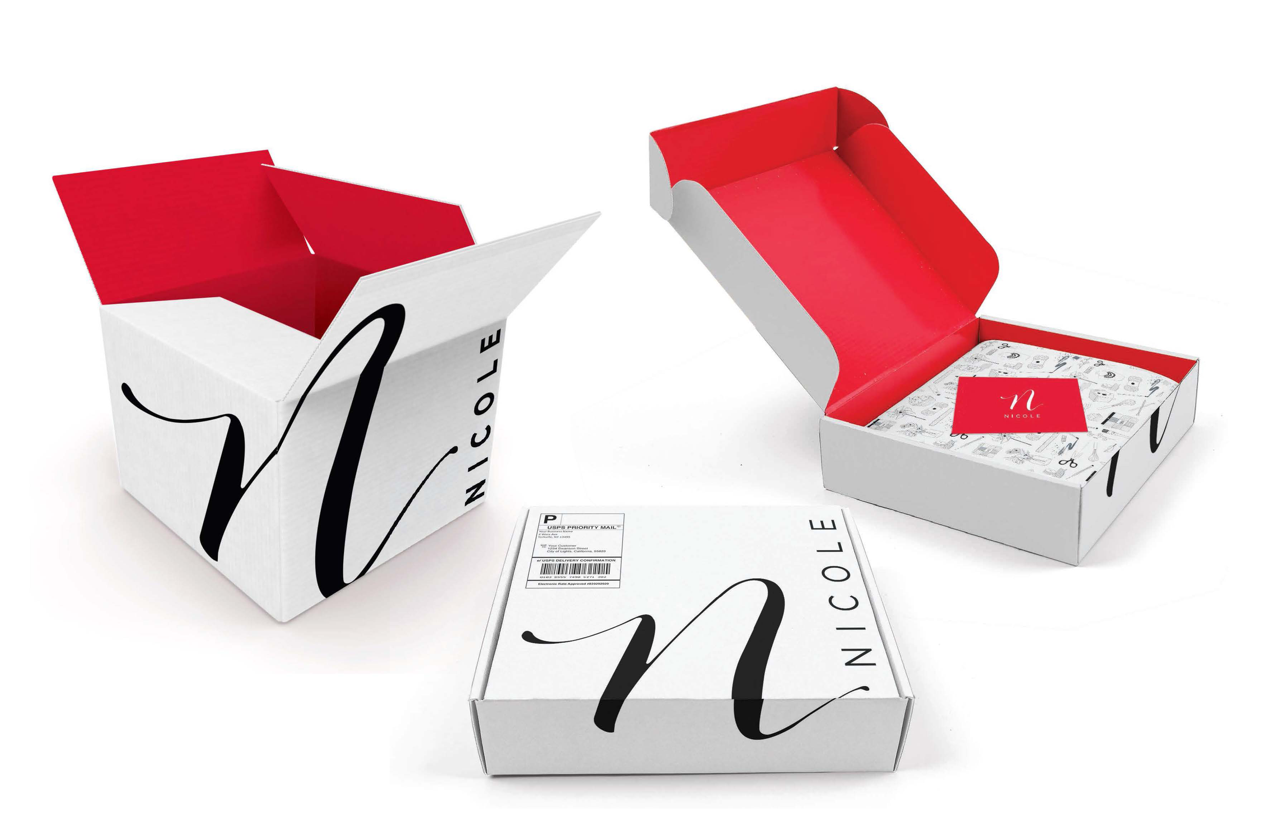
The possibilities of Nicole expanding into the e-commerce retail space.
We came up with a shipping box concept that would mirror the consumer’s experience in the store. The Packaging design needed to relate to the consumers’ sense of excitement and anticipation of receiving their art and craft supplies. A part of that was also developing a pattern that showcased A.C. Moore’s proprietary Nicole Brands.
Some of the brands Included:
Stitch Studio
Nicoles Kitchen
Seasons by Nicole
Premieré by Nicole
Nicole Basic Crafts
Love Nicole
Nicole Bead Shop
BrightMinds by Nicole
T H E P A R E N T M A R K
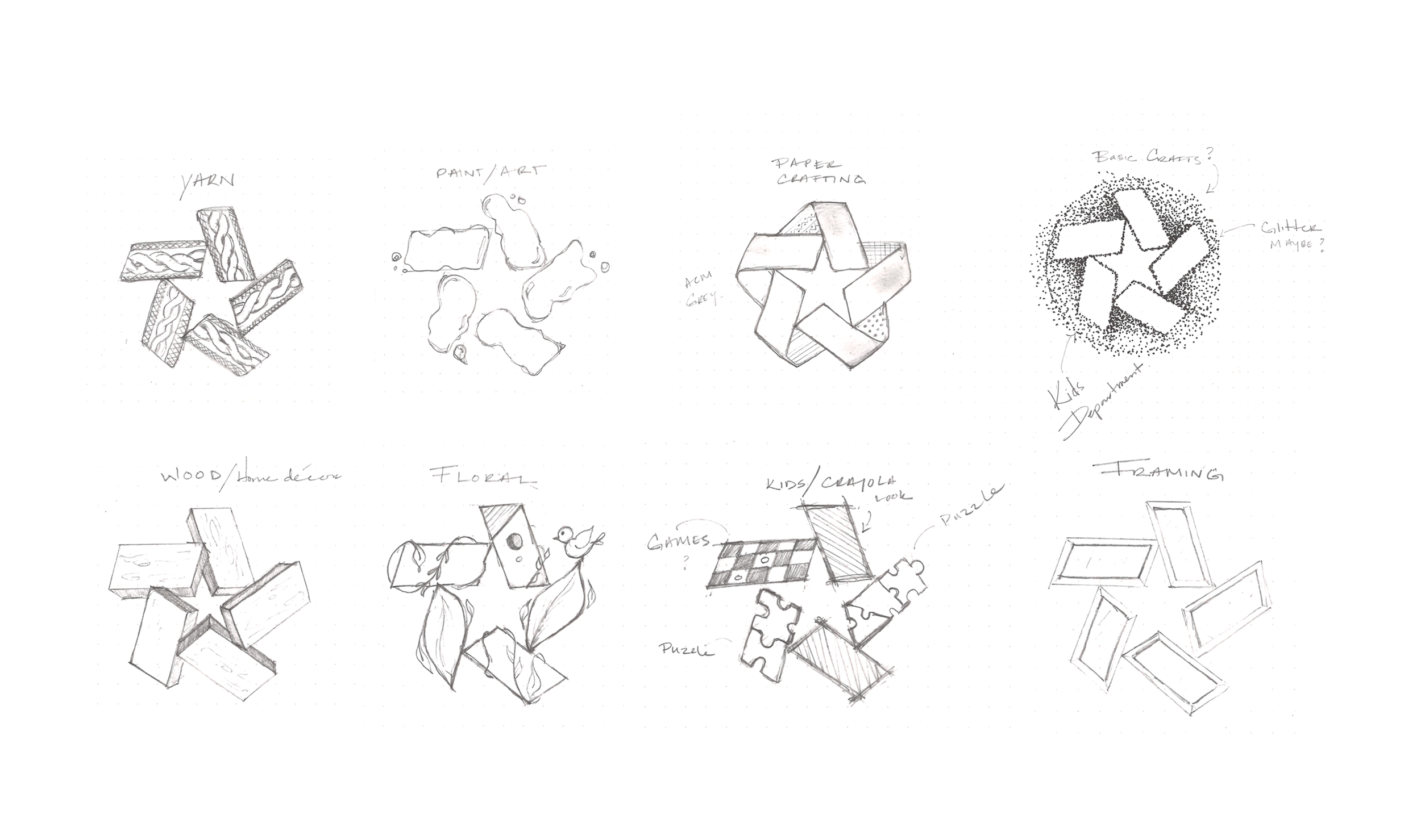
Exploring the Pinwheel
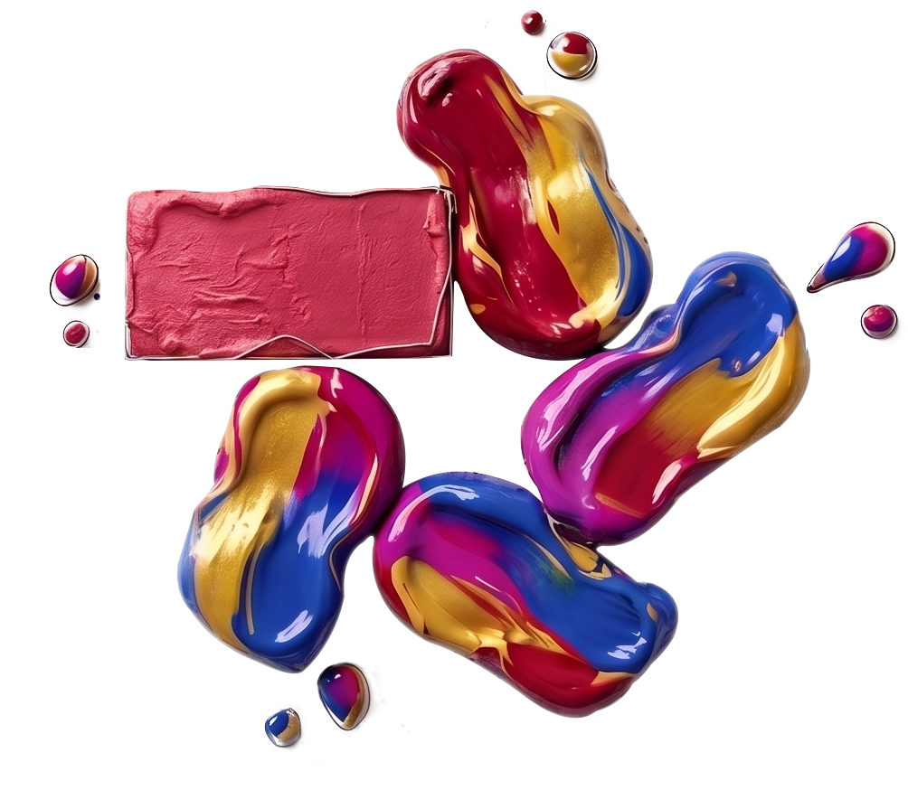
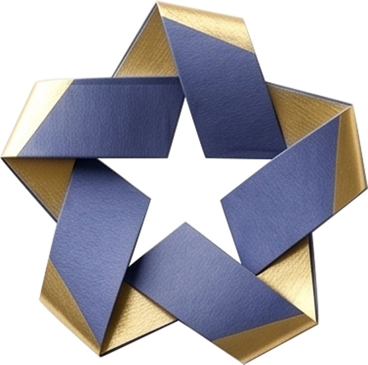
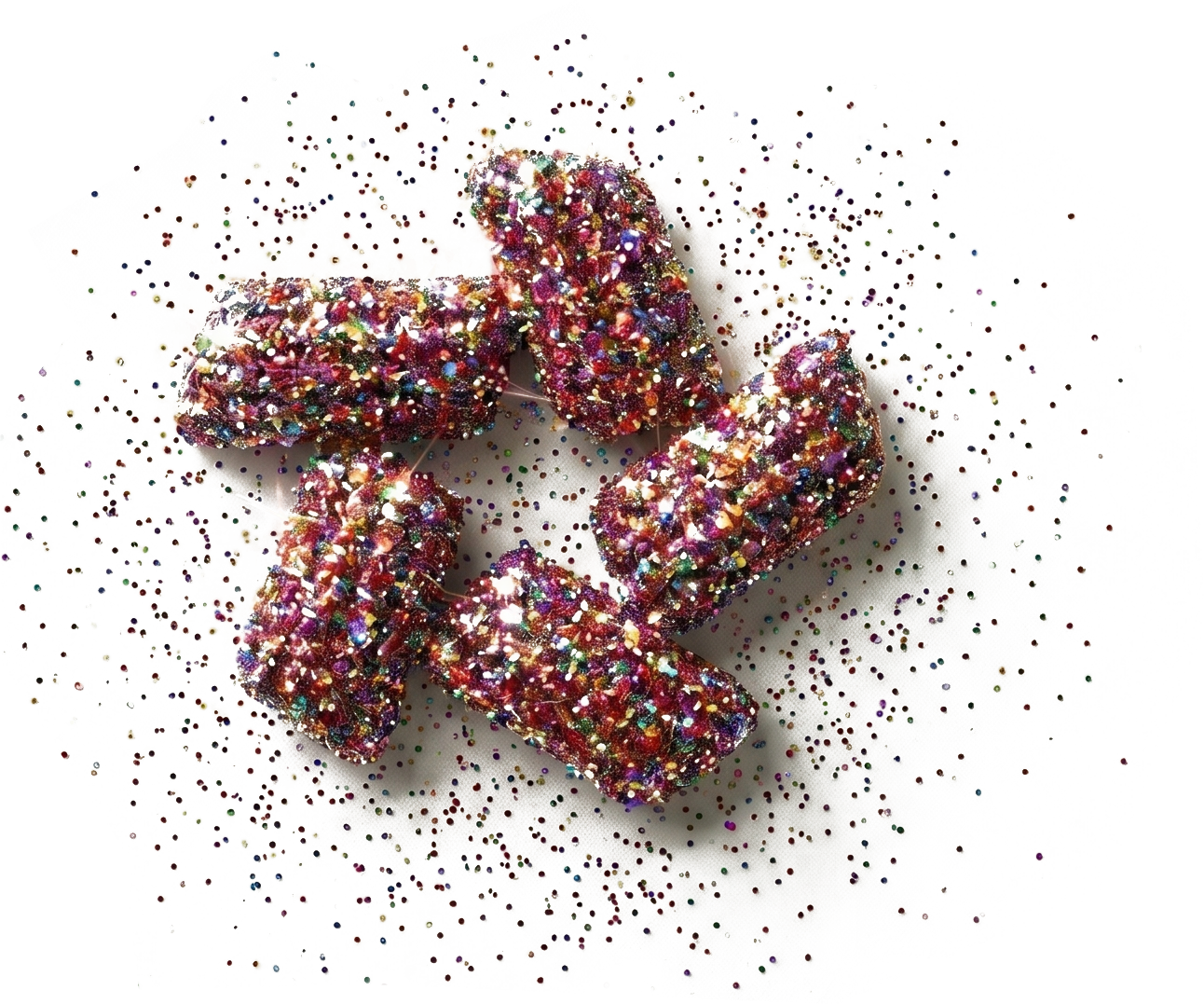
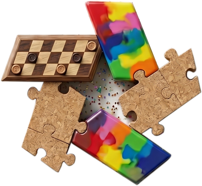
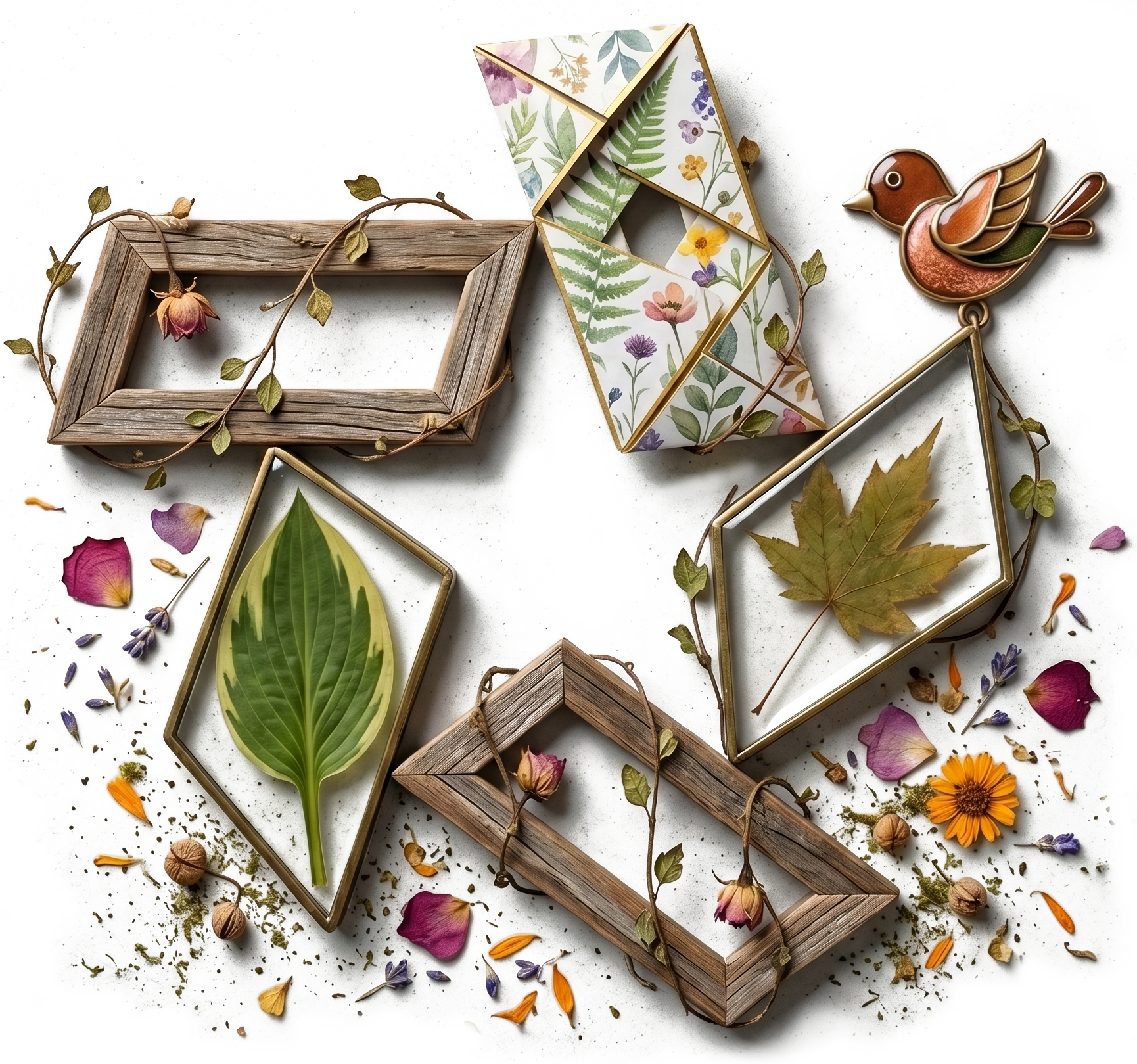
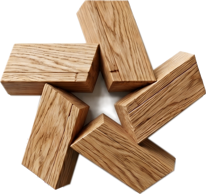
For the parent mark, the answer was eight versions of one shape. I sketched the pinwheel once for each department within the store. The star stayed; the material changed. Floral became vines, leaves, and petals. Paper crafting became folded card stock. Picture Framing became frames. Yarn became a knitted strand. Paint became spilled pigment. Wood became building blocks. While the basic craft aisles got sprinkled with glitter, the Kids Department got Crayola, puzzle pieces, and game boards.
One mark, eight voices, intended for motion, for social media, commercials, and brand animation. The viewer would always know the brand and always know the aisle.
Second Round of Explorative “N” Concepts, Calligraphy Style
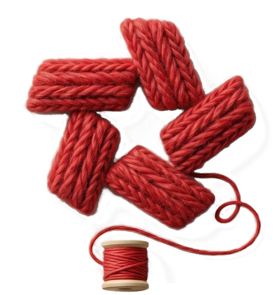
Yarn Department
Art Department
Paper Crafting Department
Basic Crafts Department
Wood Department
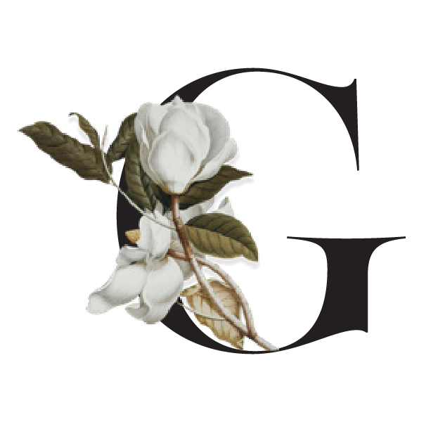
Floral Department
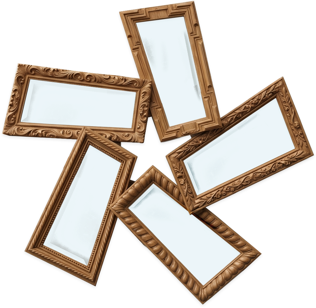
Framing Department
Kids Department